Just as I finished high school, I had an internship working at the airport. My job was to help other airport
employees fill out and file their security certification paperwork. On the desk between me and the customers
sat a phone. Unfortunately for me, as a lowly intern, I had no idea how to use it or even how to figure out
how to use it. When I needed to reach out to verify someone’s employment history or check on the status of
their paperwork, I had to type out an email and wait for a response. Had I known how to use my desk phone I
might have saved myself and my customers a lot of time by getting an immediate response.
To help our customers solve this issue we decided to make custom backgrounds for all the desk phones we sell
and support at Accelerate Networks. We want you, or anyone who needs to use your phones, to be able to learn
about a device just by picking up the receiver and looking at the screen. In our new custom background,
you’ll find a QR code. Just like when you sit down at your favorite restaurant, you can use the QR code by
opening your cell phone’s camera app and pointing it at the pattern. Tap the link that appears on your
screen, and you’ll be greeted with the support page on the Accelerate Networks website where you can learn
about and explore the features of your desk phone at your own pace.
We have a page specific to your desk phone with a list of its features and an
accompanying series of YouTube
videos that quickly explain how to use them. No longer will your interns have to stare in confusion at the
brick on their desk. Now they can solve their own problems and accelerate your business.
Early Attempts
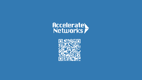
White backgrounds make it nearly impossible to read the white UI text on
Grandstream desk phones.
Additionally the UI elements cover the large portions of the sides of the screen, and smaller portions of
the top and bottom of the screen. To fix this we need to use a non-white background and make the content on
the background smaller.
Minimalism?
White text stands out too much and conflicts with the UI text on the desk phone
make it hard to read and use.
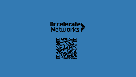
The black text is easier to read. Reducing the size of the logo make it look better on the phone. Orange
text on a blue background is hard to read on the desk phone.
How about a Gradient?
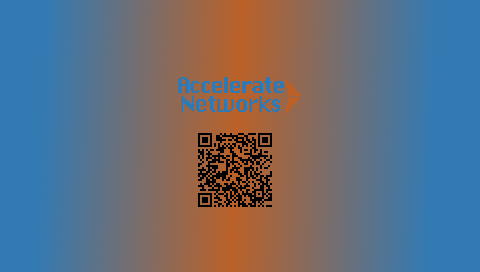
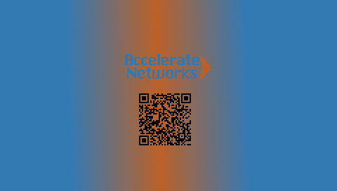
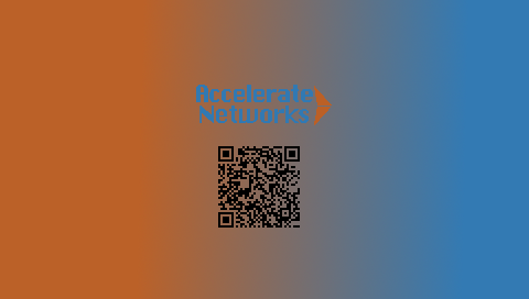
Using a gradient gives us control over what parts of the screen are best for
showing the white UI text that
the phone overlays on the background. But it's difficult to get enough contrast for the AN log to be
readable.
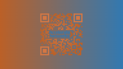
Generated by QR-code-styling
Using this fun and cool library created some cool looking QR codes. Sadly almost
all of these QR codes fail
to be read by the Camera app on iPhones as they don't have sufficient contrast against the background. Having
the logo in the center of the code or overlaying it also breaks the camera reading process for the QR code
depending on the
phone.
Mystery Attempts
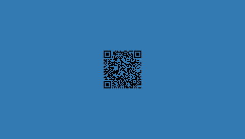
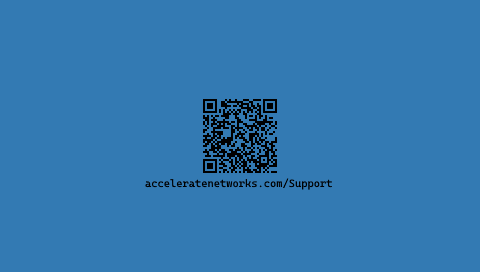
What if we drop our branding and leave just the QR code as a mystery box for the
curious? The goal is to get
the user from the desk phone and on to our website. Gamifying this process by making it a little mystery
could improve the conversion rate.
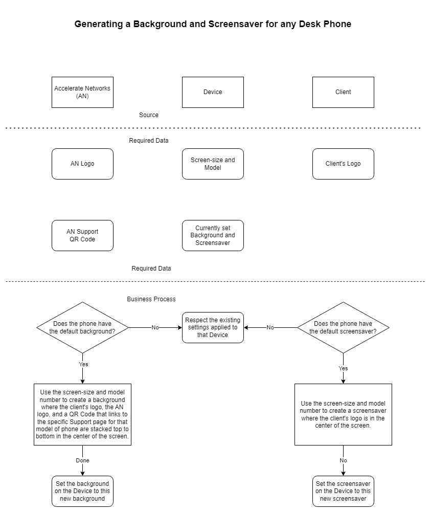
What is really required here?
Here's a diagram of what data is required to generate a background, who it comes from, and what the process
is for deciding to generate a background or screensaver.
I think is this the absolute minimum information required to generate a custom
background image for a phone.










.png)
.png)
.png)
.png)
.png)
.png)
.png)
.png)
.png)
.png)
.png)
.png)
.png)
.png)
.png)
.png)
.png)